Using MARTINI’s HDF5 output
MARTINI offers an option to output mock observation data cubes in HDF5 format. Below is an example illustrating reading the output and making a plot of the first three moments of a data cube.
Note
This example script requires MARTINI v2.1.3 or newer.
import h5py
import numpy as np
import matplotlib.pyplot as plt
from astropy import units as U
from martini import demo

hdf5file = "testcube.hdf5"
demo(hdf5file=hdf5file)
with h5py.File(hdf5file, "r") as f:
    flux_cube = f["FluxCube"][()] * U.Unit(f["FluxCube"].attrs["FluxCubeUnit"])
    ra_vertices = f["RA_vertices"][()] * U.Unit(f["RA_vertices"].attrs["Unit"])
    dec_vertices = f["Dec_vertices"][()] * U.Unit(f["RA_vertices"].attrs["Unit"])
    spec_vertices = f["channel_vertices"][()] * U.Unit(
        f["channel_vertices"].attrs["Unit"]
    )
    vch = (
        f["velocity_channel_mids"][()]
        * U.Unit(f["velocity_channel_mids"].attrs["Unit"])
        - 210 * U.km / U.s  # subtract systemic velocity here
    )

# if the RA range straddles RA=0 it's easier to plot on a -180<RA<180 range:
ra_vertices = np.where(
    ra_vertices > 180 * U.deg, ra_vertices - 360 * U.deg, ra_vertices
)

# choose units for plotting, not necessarily the units data are stored in:
ra_unit = U.deg
dec_unit = U.deg
mom0_unit = U.Jy / U.beam
mom1_unit = U.km / U.s
mom2_unit = U.km / U.s

fig = plt.figure(figsize=(16, 5))
sp1 = fig.add_subplot(1, 3, 1, aspect="equal")
sp2 = fig.add_subplot(1, 3, 2, aspect="equal")
sp3 = fig.add_subplot(1, 3, 3, aspect="equal")

# estimate RMS noise in the cube, in this case from a corner patch with little signal:
rms = np.std(flux_cube[:16, :16])

# simple 3D source mask by clipping above the noise:
clip = np.where(flux_cube > 5 * rms, 1, 0)

mom0 = np.sum(flux_cube, axis=-1)

# mask for higher moments to focus on high-density regions:
mask = np.where(mom0 > 0.05 * U.Jy / U.beam, 1, np.nan)

mom1 = np.sum(flux_cube * clip * vch, axis=-1) / mom0
mom2 = np.sqrt(
    np.sum(flux_cube * clip * np.power(vch - mom1[..., np.newaxis], 2), axis=-1)
    / mom0
)
im1 = sp1.pcolormesh(
    ra_vertices[..., 0].to_value(
        ra_unit
    ),  # pick one channel in ra_vertices, coordinates are the same in all of them
    dec_vertices[..., 0].to_value(
        dec_unit
    ),  # pick one channel in dec_vertices, coordinates are the same in all of them
    mom0.to_value(mom0_unit),
    cmap="Greys",
)
plt.colorbar(im1, ax=sp1, label=f"mom0 [{mom0_unit}]")
im2 = sp2.pcolormesh(
    ra_vertices[..., 0].to_value(
        ra_unit
    ),  # pick one channel in ra_vertices, coordinates are the same in all of them
    dec_vertices[..., 0].to_value(
        dec_unit
    ),  # pick one channel in dec_vertices, coordinates are the same in all of them
    (mom1 * mask).to_value(mom1_unit),
    cmap="RdBu_r",
    vmin=-np.nanmax(np.abs(mom1 * mask)).to_value(mom1_unit),
    vmax=np.nanmax(np.abs(mom1 * mask)).to_value(mom1_unit),
)
plt.colorbar(im2, ax=sp2, label=f"mom1 [{mom1_unit}]")
im3 = sp3.pcolormesh(
    ra_vertices[..., 0].to_value(
        ra_unit
    ),  # pick one channel in ra_vertices, coordinates are the same in all of them
    dec_vertices[..., 0].to_value(
        dec_unit
    ),  # pick one channel in dec_vertices, coordinates are the same in all of them
    (mom2 * mask).to_value(mom2_unit),
    cmap="magma",
    vmin=0,
)
plt.colorbar(im3, ax=sp3, label=f"mom2 [{mom2_unit}]")
for sp in sp1, sp2, sp3:
    sp.set_xlabel(f"RA [{ra_unit}]")
    sp.set_ylabel(f"Dec [{dec_unit}]")
    sp.set_xlim(sp.get_xlim()[::-1])

plt.subplots_adjust(wspace=0.3)
plt.show()
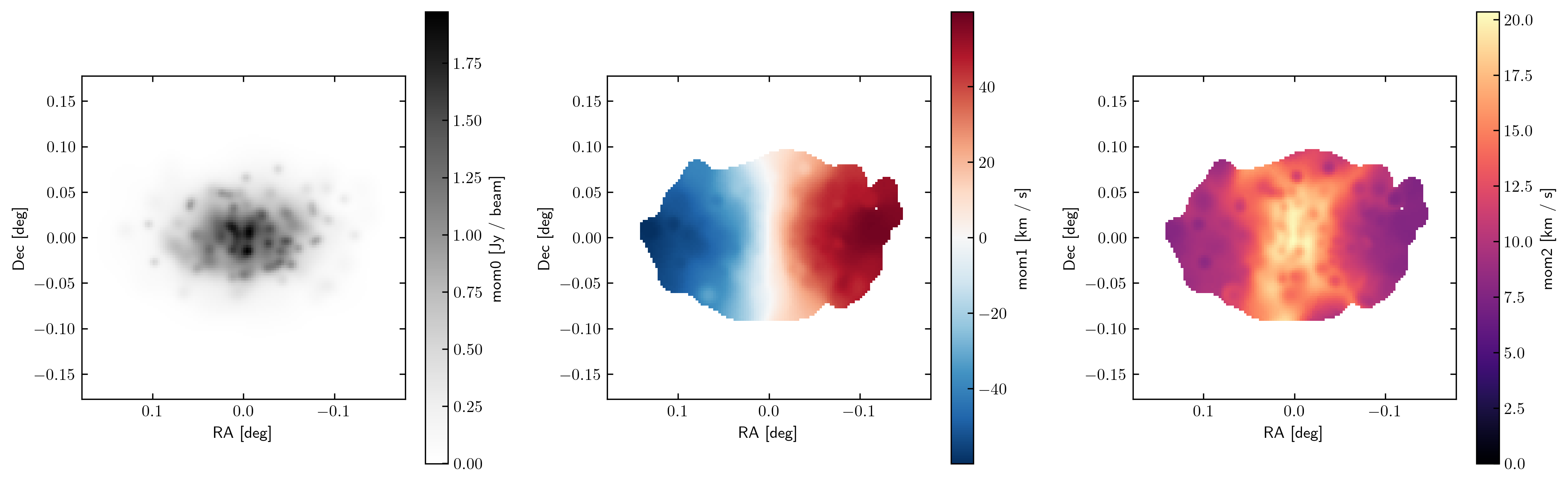
This produces the figure: